15 Squarespace Ecommerce Examples to Inspire Your Site
Table of Contents
Good design builds instant trust and increases user engagement for e-commerce websites. But unless you’re a professional web designer, it can be hard to create a beautiful website that nudges visitors towards buying.
That’s where these ecommerce website examples can help.
In this post, you’ll find 15 Squarespace website examples to get your creative juice running. From clothing stores to art shops, you will see how different businesses jazz up Squarespace templates to create their unique sites.
1. Sunday State
URL: https://www.sundaystate.ca/
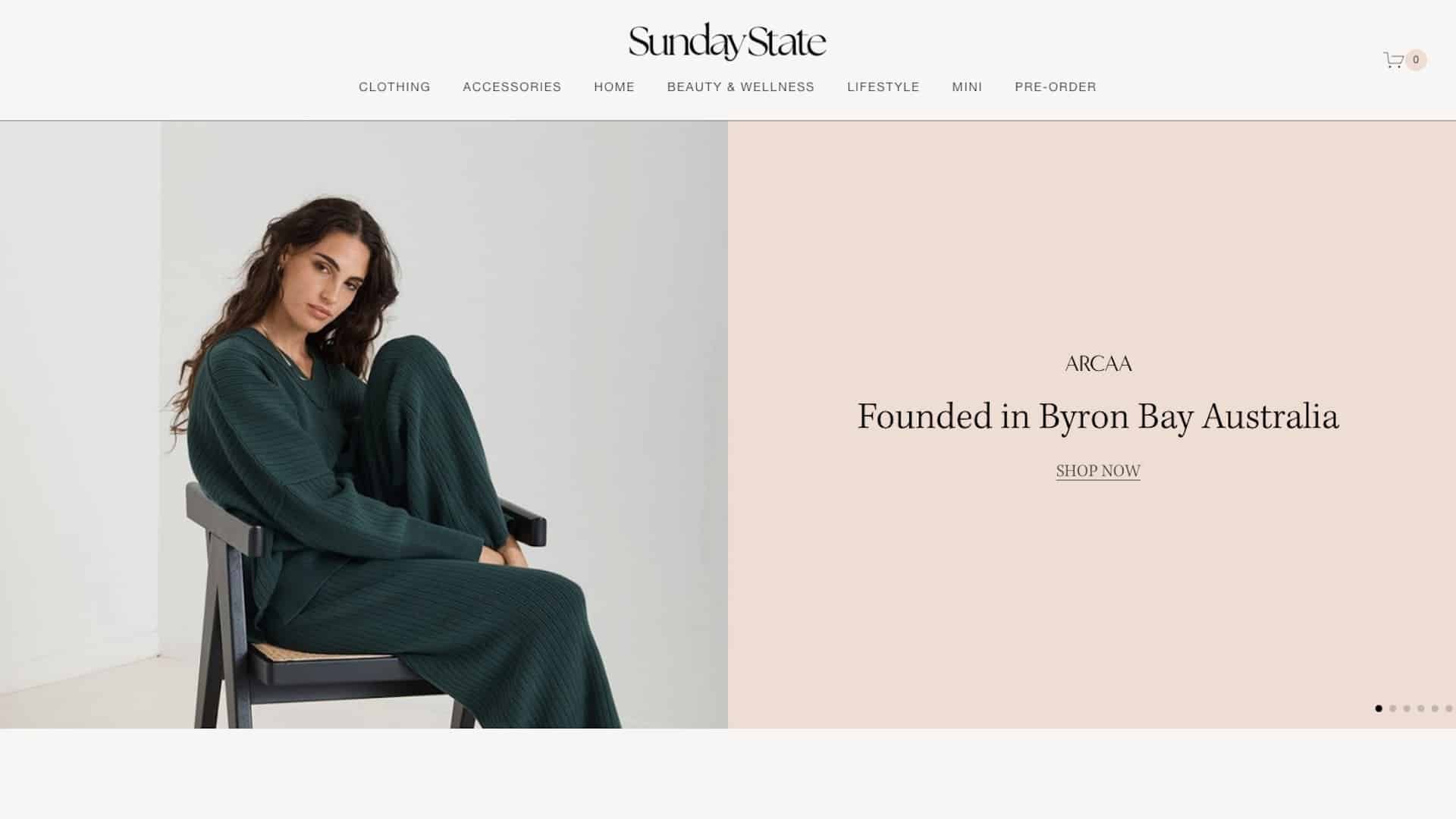
Sunday State is a lifestyle boutique that sells a curated selection of ethical fashion, clean beauty, and home goods.
The website stands out by its clarity and simplicity. There are clear call-to-actions, shop categories, and featured products right from the home page. The messaging is concise and compelling, focusing on both function and emotions. The clean layout enhances the user experience, making it easy for visitors to navigate and explore their thoughtful collections.

2. 1st R.O.W. Estate Winery
URL: https://1row.ca/
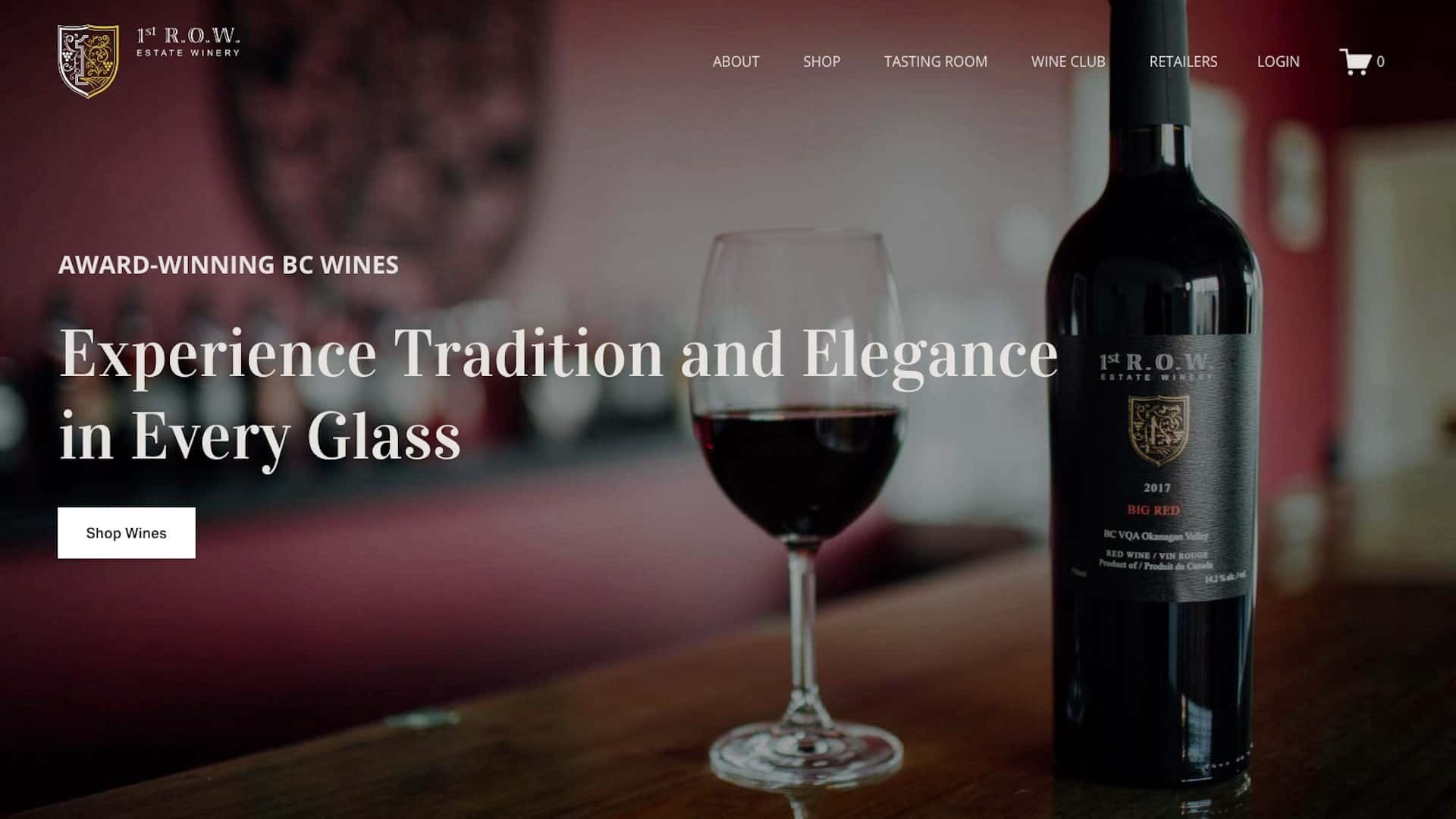
1st R.O.W. specializes in premium wines made from a traditional process.
Their website mirrors a wine-drinking experience, with a thoughtful color scheme and slow animations that evoke a sense of leisure. The site's simplicity, clear call-to-actions, and prominently featured popular products on the homepage contribute to a user-friendly navigation experience, enhancing the overall appeal for wine enthusiasts.

3. Muff & Co
URL: https://www.muff.co/
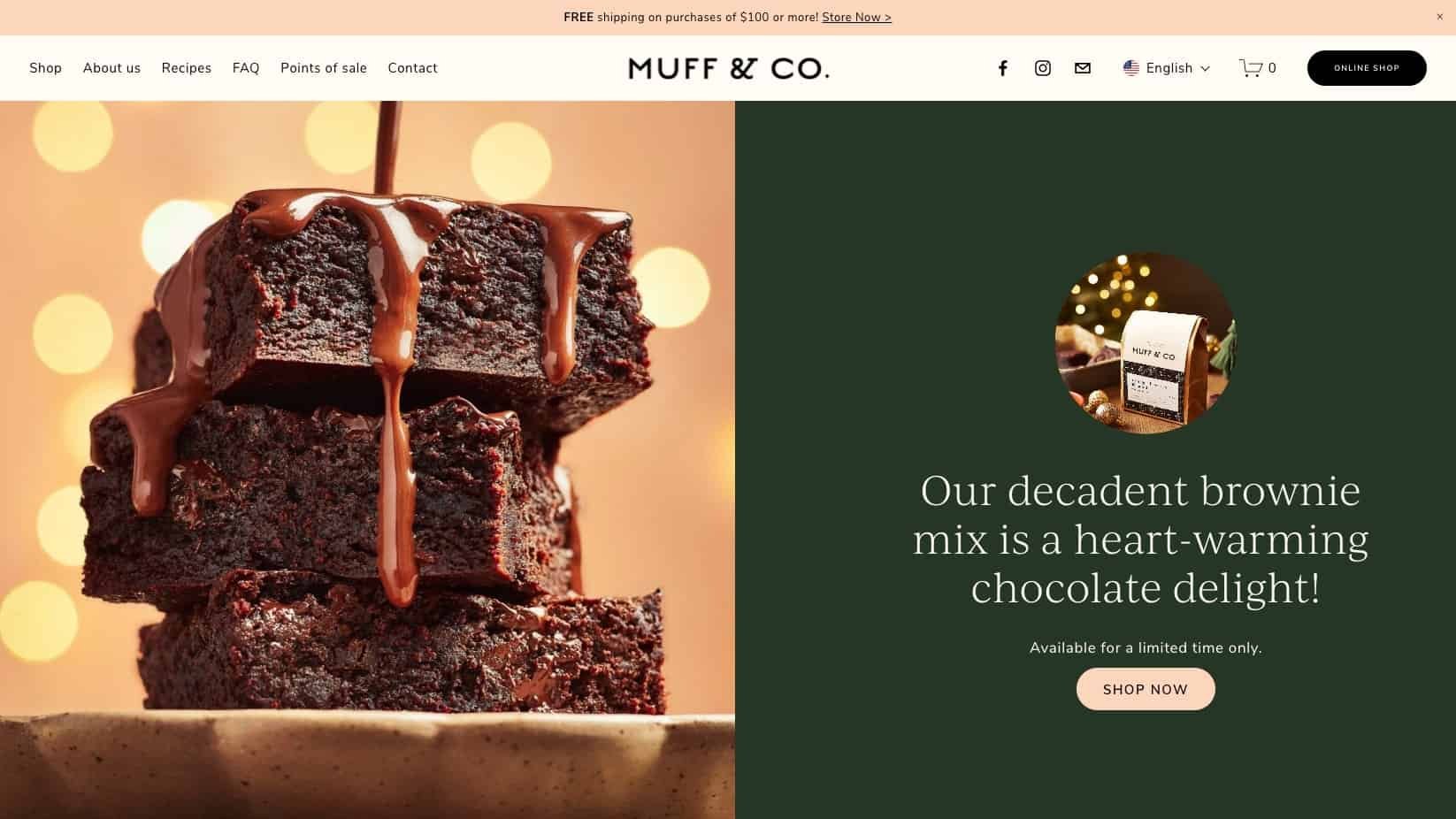
Muff & Co offers a variety of muffin mixes, cookies, pancakes, waffles, and other gourmet collections.
This website is a great example of bilinguage e-commerce site. The website strategically presents a variety of muffin mixes and related products with a visually clean layout and a seamless navigation flow. There are various high-quality mouthwatering photos throughout the site. The warm color palette helps attract attention and evoke appetite.

4. AAKS Hand Crafted
URL: https://www.aaksonline.com/
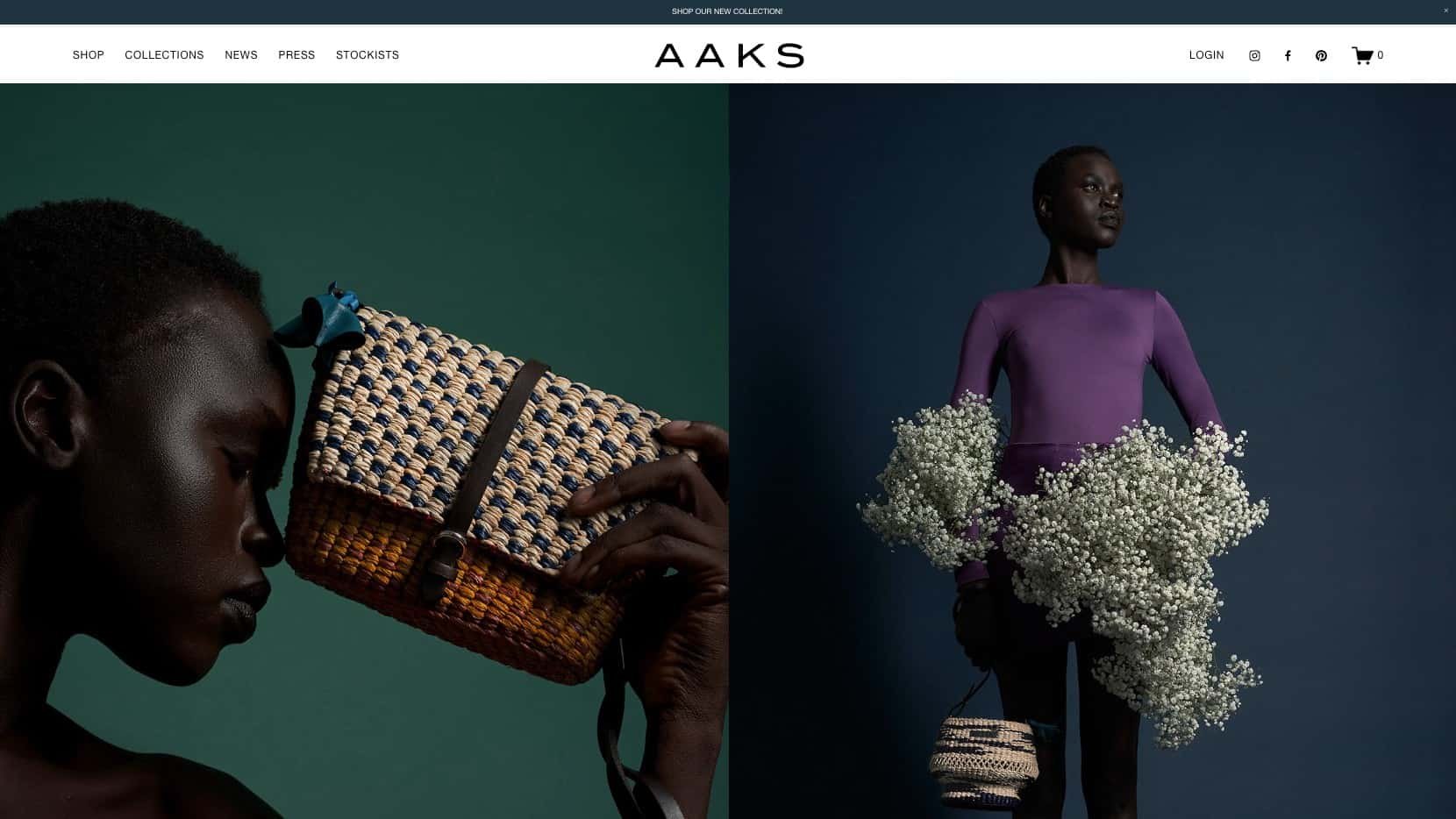
AAKS sells colorful handcrafted bags that are made in a small tranquil village in Ghana.
Their website immediately captures your attention with high-quality and stylish photography. The site layout and colors are minimal, creating space for the product photos to shine. The use of bold colors in photos and uncluttered layout helps to drive home the brand values: craftsmanship, authenticity, and a strong sense of identity.

5. Studio Lux
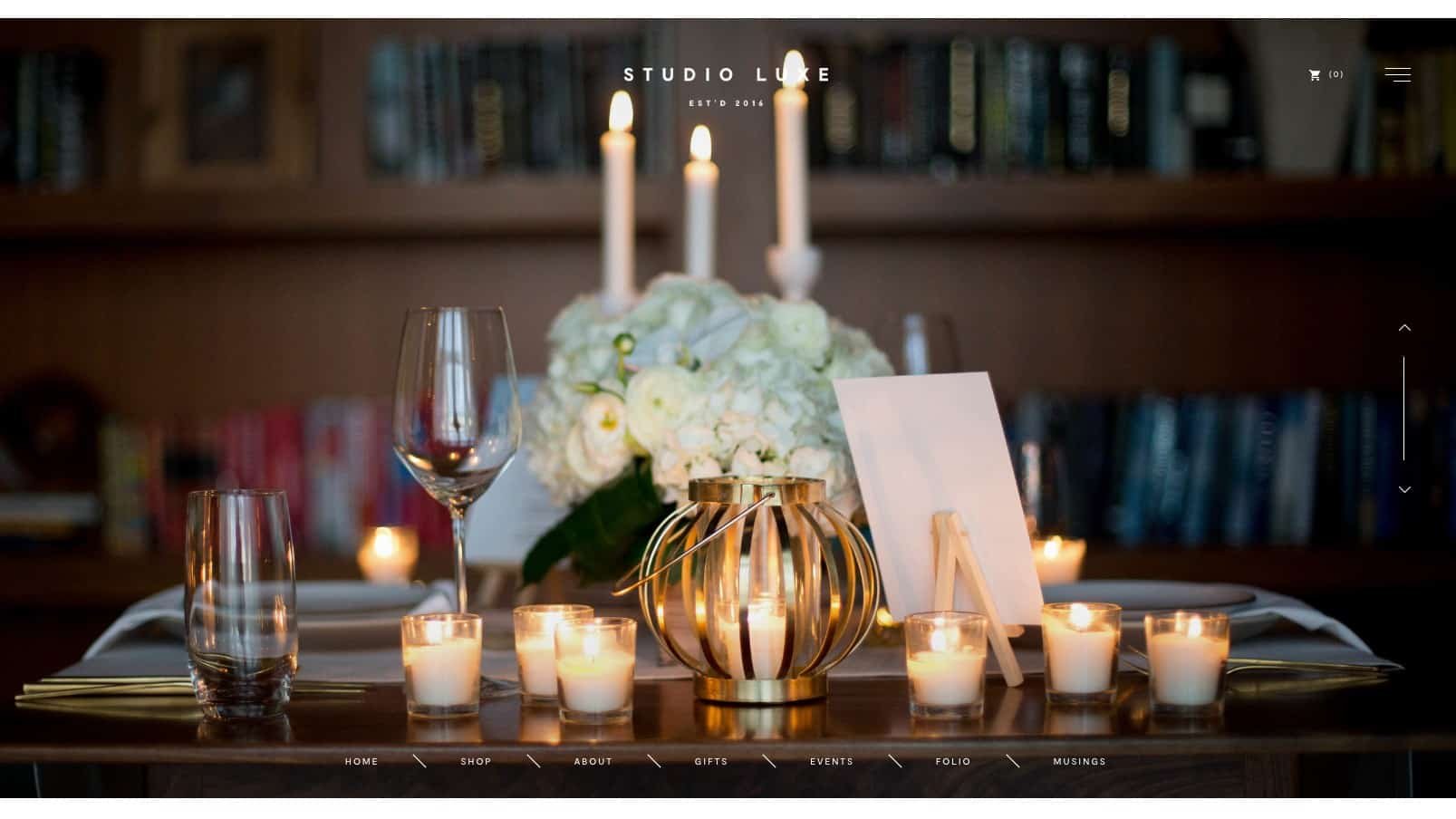
Studio Luxe specializes in refined events, gifts, and interiors, offering a thoughtfully curated selection of gift boxes for women, men, babies, and corporate employees.
Their website is a great example of visual design that supports brand messages. From the banner images to the creamy background color throughout the site, you can sense a quiet, graceful beauty. The photos are placed neatly in boxes and the entire site design also has a white border, which makes it easy to imagine the insides of their gift boxes are just as organized. The site navigation is streamlined and user-friendly.

6. Creative by Kreete
URL: No Longer Active
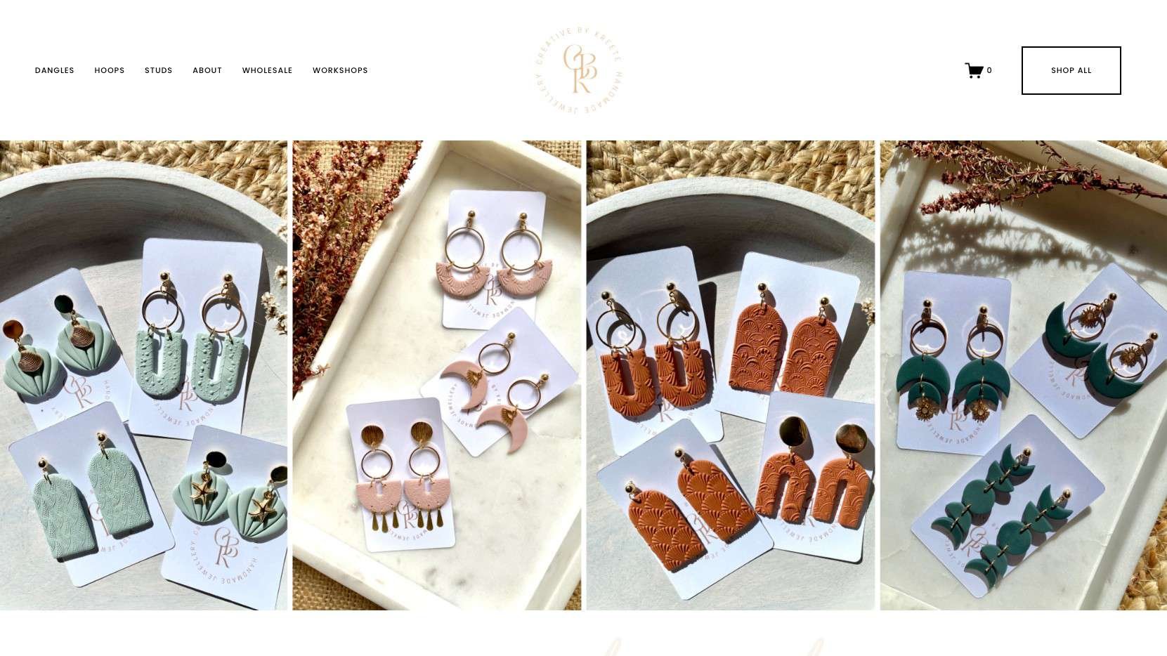
Creative by Kreete offers handmade earrings crafted from polymer clay, proudly made in Dubbo, NSW.
Their website immediately captivates with photos of their unique, handcrafted polymer clay earring products. The typography is playful and artistic. The product photos have the same background, which contributes to the uniform aesthetic of the whole site. The visually appealing design and intuitive navigation showcase the artistry of each piece, providing an engaging and delightful online shopping experience.

7. Cosmik Ice Cream
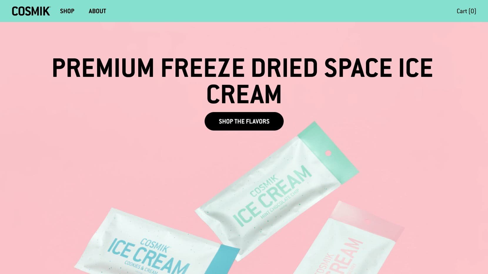
Cosmik produces snackable, freeze-dried ice cream, making it possible to enjoy this cold sweet heaven’s treat even when you’re on the road.
The site uses a bright, colorful color scheme, which fits well with the food industry in general and speaks to the playful, creative nature of the product. As the shop has a small number of products, it was smart to display and allow users to buy products right from the home page. They also offer free shipping on 2+ items, which incentivizes users to buy more. The press section is short but impactful with punchy quotes from well-known publishers.

8. Staay
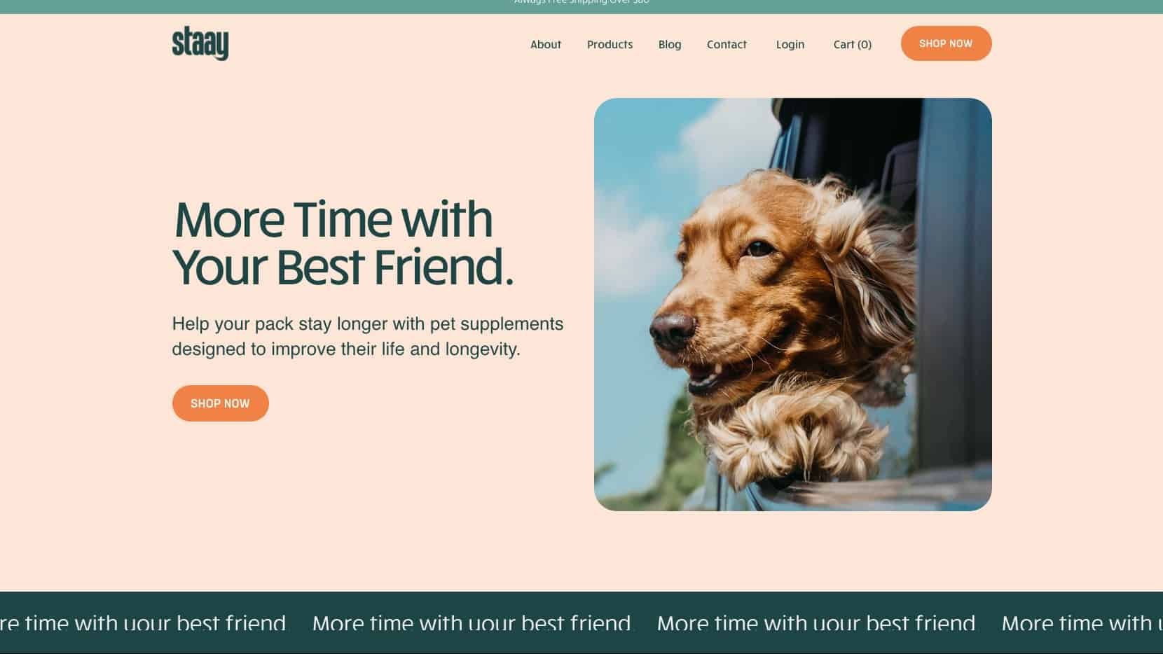
Staay sells pet supplements designed to enhance pet's life and longevity.
The company clearly communicates its unique value proposition in the website copy. The warm colors create a friendly and trustworthy feeling for the brand. Their product pages provide a lot of product details without making it overwhelming to read. With cute design and clear messages, this is a great example of an effective Squarespace e-commerce website.

9. On Sundays
URL: https://www.onsundays.co.nz/
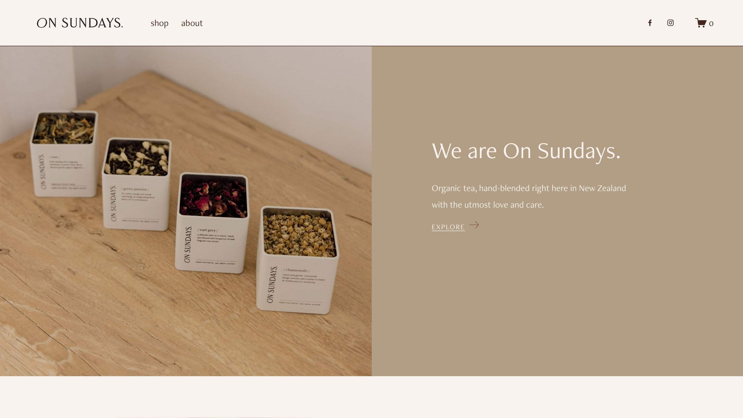
Not to be confused with our first example, On Sundays is a tea company specializes in organic, hand-blended tea in New Zealand.
This e-commerce website is an example of quality over quantity. Their homepage uses a creative image overlay style with a subtle moving graphic, which creates a calm, slow, and dreamy atmosphere. The design is minimalistic, presenting just enough information at every step. The retro photograph style is used consistently, which makes their brand visual identity unique and memorable.

10. Blackbird Foods
URL: https://www.blackbirdfoods.com/
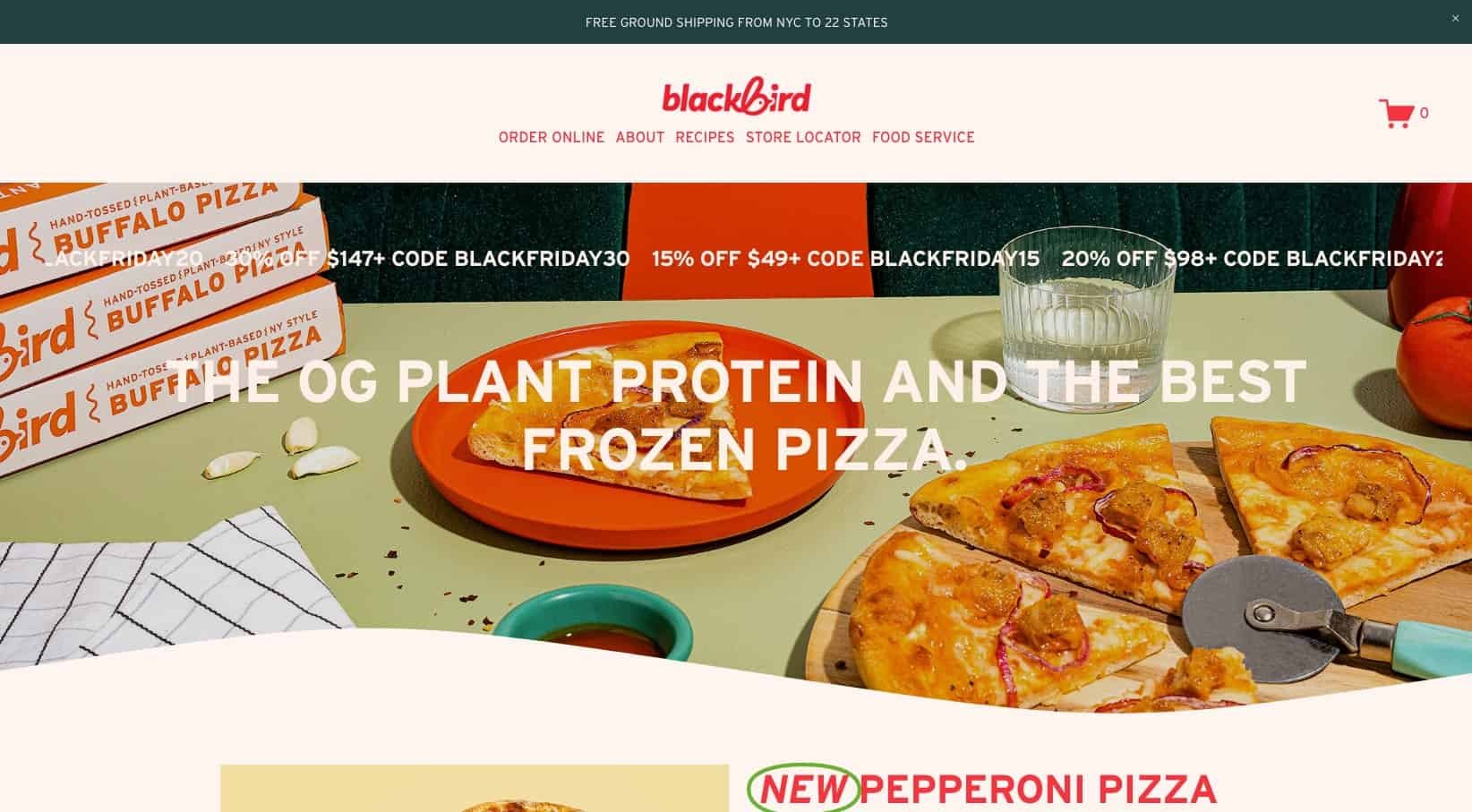
Blackbird Foods is an artisanal producer of plant-based pizza, seitan, and wings for both wholesale and retail customers.
From the first impression, this website is vibrant and inviting. The design employs bold colors, strong typography, large images, and various icons and graphics. This enhances the visual appeal, creating a dynamic and engaging online shopping space.

11. Shop Creative Law
URL: https://www.shopcreativelaw.com/
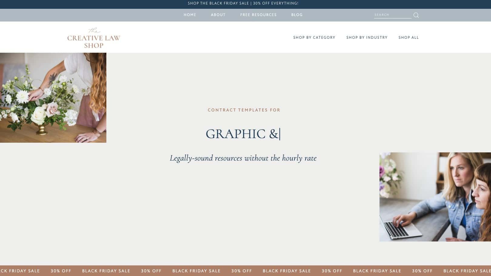
The Creative Law Shop is a creative entrepreneur’s online shop for attorney-drafted, industry-reviewed legal contract templates & educational resources.
I came across this site while looking for a legal template, and it was a great example of website navigation and structure. As the shop has a large number of products, they include two options in top navigation: “Shop by Category” to browse based on your occupation, and “Shop by Industry” to browse based on product type. The home page follows a logical structure, with value proposition first, then freebie offer, and featured products.
Unlike physical products which can use photos to communicate, with digital and services products, you need to provide more information to give customers confidence. In the case of Shop Creative Lase, they have unique and detailed description for each product, which helps customers feel safe when they can’t see or return/exchange the product.

12. Ave Lumi
URL: https://www.ave-lumi.com/
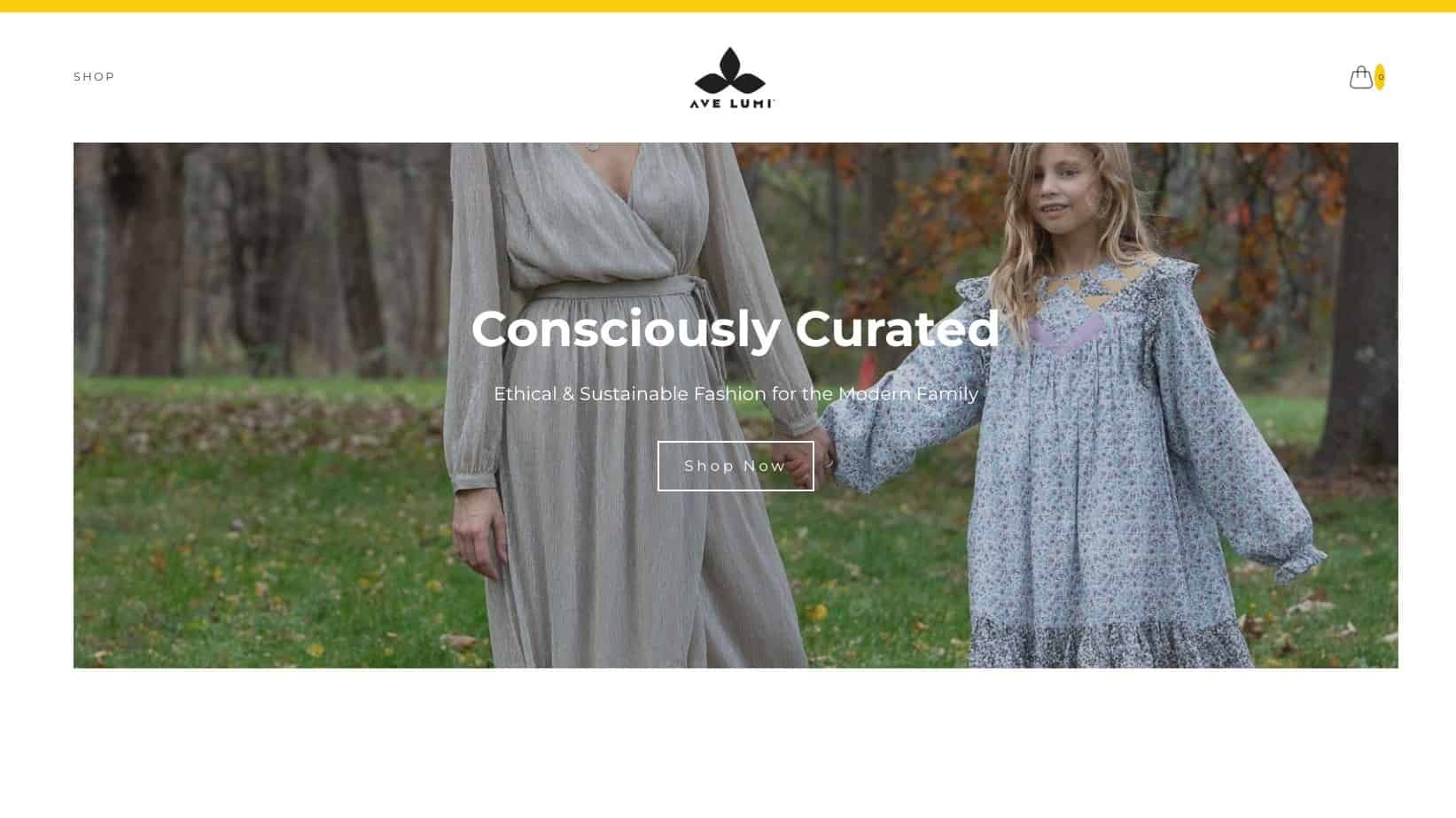
Ave Lumi curates a timeless selection of apparel, accessories, and gifts to improve the sustainability of the fashion industry.
The site's design is clean and minimalist. The store differentiates by its brand story, which is communicated on the home and about pages.

13. Betty Lu Paperie
URL: https://www.bettylupaperie.com/
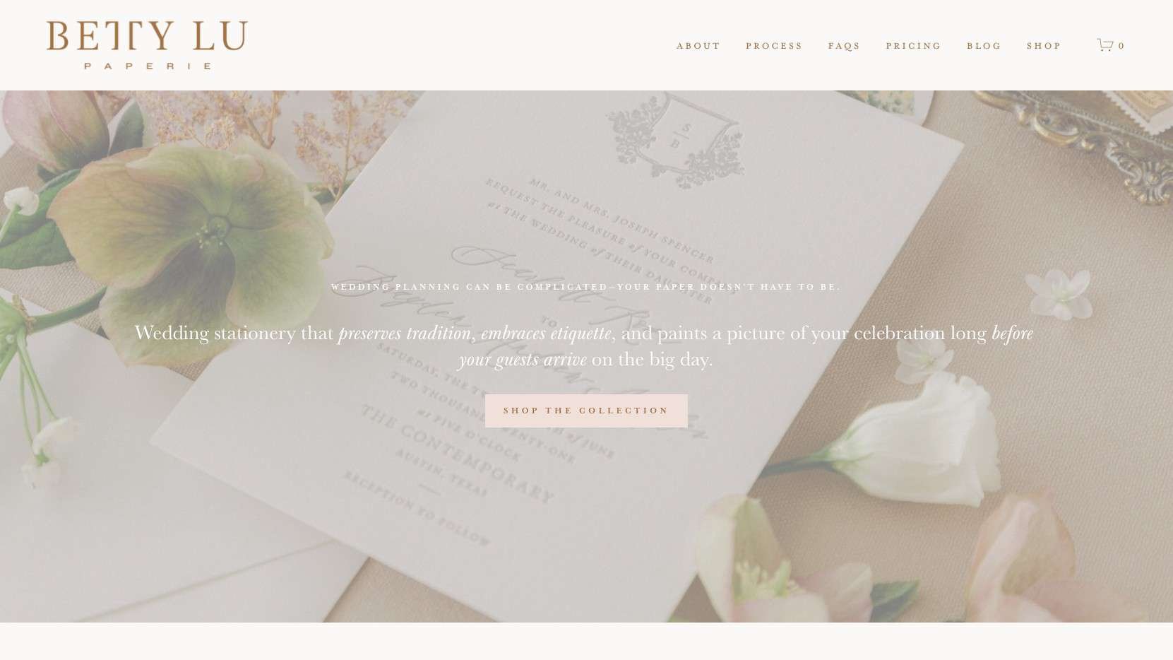
Betty Lu Paperie specializes in wedding stationery, offering meticulously designed collections of luxuriously elegant and romantic paper goods.
Soft and flowy, this website is inspiring for any business that wants a feminine, elegant style. One thing that stands out with the site is copywriting. The homepage’s copy takes you smoothly from problem to solution and introduces different aspects of the brand.

14. Alissa Bell
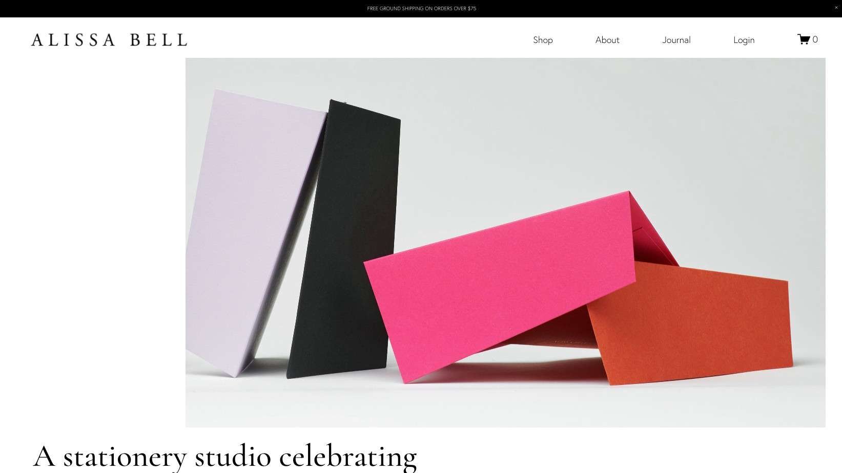
Alissa Bell’s studio sells stationery with a color and simple design.
With a creative layout design with beige colored palette, their website feels elegant, sophisticated, and quality. The shop page features a nice filter-by-category feature to help customers navigate through their large catalog of products.

15. Poppy Made By Hand
URL: https://www.poppymadebyhand.com/
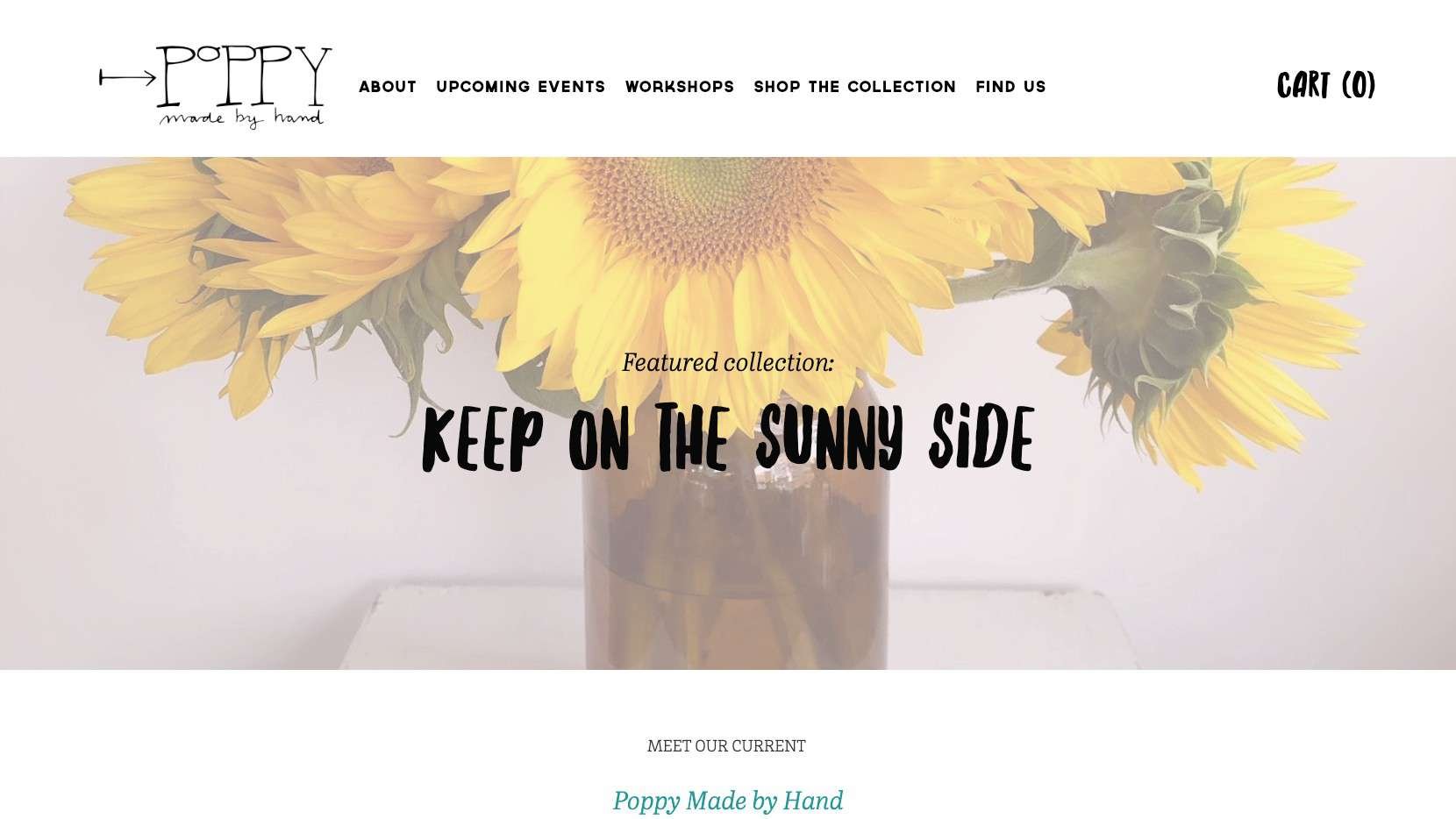
Poppy Made By Hand sells a variety of artisan-made goods that make a perfect gift for people you care about.
The website distinguishes itself through a minimalist design, fostering a neat and welcoming environment for users to discover and value the unique collection of handcrafted gifts.

Conclusion
Do you have a favourite ecommerce website example? Let us know in the comment - we love seeing examples of good websites around the world!

